Visualising South African Renewable Energy Applications in 2015
Visualising South African Renewable Energy Applications in 2015
The Department of Environmental Affairs maintain the South African Renewable Energy EIA Application Database which is updated quarterly for their web-based map viewer here or in downloadable format here.
I wanted to better understand the scope of renewable energy development in South Africa and therefore decided to analyse the applications for renewable energy technologies made in the 2nd and 3rd quarters of 2015 to the Department of Environmental Affairs. I was looking for insight into different renewable energy technologies, as well as the status of these applications ie the megawatt capacity approved, or in process. As the available data is in spatial format (the Department of Education provides both ESRI shapefiles and MapInfo table files), I decided to look at some statistics at a provincial level. This kind of analysis could potentially be tracked on an ongoing basis going forwards as each quarter’s data is released, or trended backwards with the historical data that is available to the public.
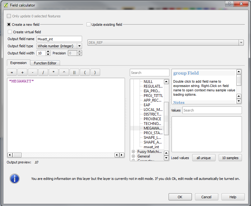
The first minor hurdle that I encountered was that the megawatt field was in text format, and needed to be converted to integer format in order to calculate the statistics that I wanted. I utilised the field calculator in QGIS to add a new field which I called “Mwatt_int” and populated it with the values from the “Megawatt” column:
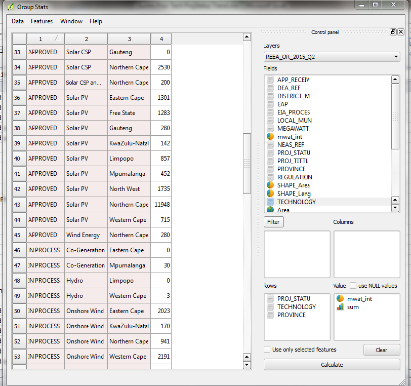
With the data now in the correct format, I was able to utilise the Group Stats plugin in QGIS in order to calculate some statistics on both 2015 Q2 and Q3 data:
I then exported the results into a CSV file in order to analyse the 2 quarterly sets of statistics together.
The first insight I gained is that the majority of renewable energy applications in South Africa are unsurprisingly those that utilise either Onshore Wind or Solar PV (Photovoltaic) technologies.
Our climate in South Africa is clearly supportive of these technologies, and it’s reassuring to know that technologies that utilise these free sources of energy are in fact being implemented.
Next I wanted to look more closely at where the incidences of those applications that are still in process, for the categories of Onshore Wind and Solar PV, are located. The datasets break down application status classes into “Approved”, “In Process”, “Preferred Bidder in Round 1”, “Preferred Bidder in Round 2”, “Preferred Bidder in Round 3”, and “Withdrawn / Lapsed”. To my mind an applicant who is classified as a preferred bidder, regardless of round, is an application that is still in process, so for the purposes of simplifying the exercise, I have summed the megawatt capacities for the classes of “In process” and “Preferred Bidder”s, and therefore created a new subset of just three status classes, “Approved”, In Process” or “Withdrawn / Lapsed”.
So clearly, the Northern Cape is where it’s at, for the predominance of applications that are still in process for the second and third quarters of 2015.
Finally, for a geographic visualisation of the data, I mapped the 2015 Q3 data to get a better idea of the location of the projects within the categories of Onshore Wind and Solar Photovoltaic technologies in the Northern Cape province.
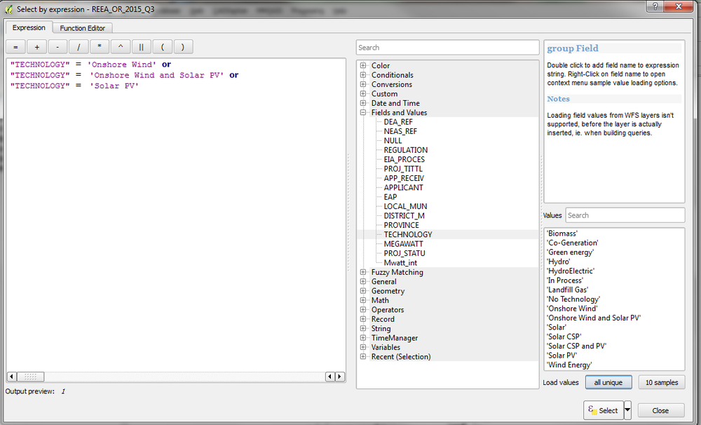
In order to map the data that I wanted to see, I had to run 2 selections on the data, the first to select the relevant categories:
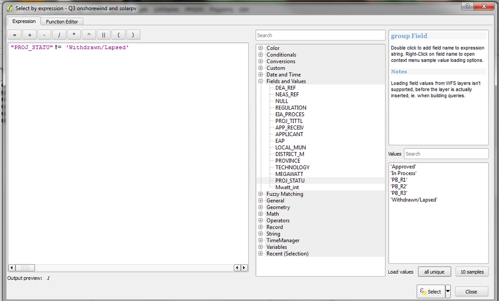
And the second to eliminate those applications that are no longer active:
which resulted in a sub-set of the applications that utilise Onshore Wind and Solar Photovoltaic applications that haven’t been withdrawn.
Cartodb is great for visualising data online, shapefiles need to be zipped in order to be uploaded. A note of caution, ensure you close your GIS project before you do this, or the files won’t compress accurately.


